This page provides performance statistics of my DivGro portfolio as of 31 December 2022.
See my most recent monthly, quarterly, and annual reviews.
Data and charts are loaded from online spreadsheets and will take a few seconds to populate.
Portfolio Statistics
The following spreadsheet shows some statistics for DivGro.
Here is a chart showing DivGro's market value breakdown. Dividends are plotted at the chart's base so we can enjoy seeing the growth over time.
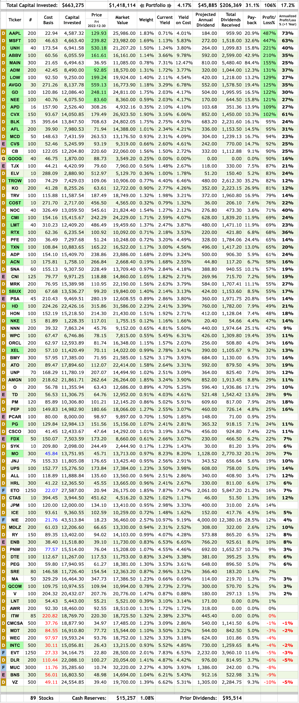
Here is a snapshot of DivGro's status as of the most recent monthly review.
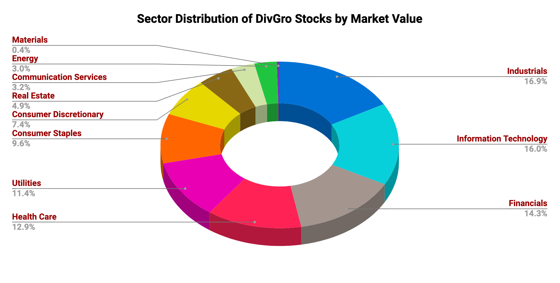
The accompanying chart shows the sector distribution of DivGro's holdings. I'm no longer attempting to balance out DivGro's holdings across the 11 GICS sectors. Nevertheless, it is good to monitor the distribution in case changes are needed:
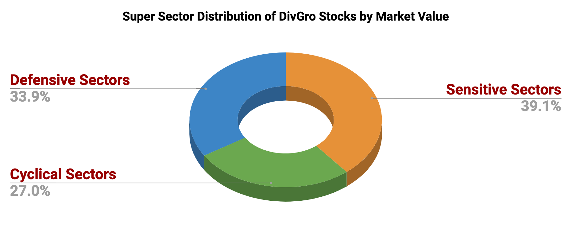
Below is a chart showing the super sector distribution of DivGro stocks:
Data and charts are loaded from online spreadsheets and will take a few seconds to populate.
Portfolio Statistics
Here is a chart showing DivGro's market value breakdown. Dividends are plotted at the chart's base so we can enjoy seeing the growth over time.
Portfolio Holdings

Please visit my Snapshots History page to see a history of end-of-month snapshots.
Sector Distribution


I'm looking to increase my exposure to defensive stocks and generally diversify my portfolio more evenly among the super sectors. Longer-term, I need to slowly transition to a much more defensive distribution, especially as I approach retirement.
Dividend Income and Projections
Below is a chart showing monthly dividend income plotted along with projected monthly dividend income (PMDI), which is the monthly income I can expect to receive from DivGro, on average, over the next year.
The wildly varying dividend income from month to month makes the above chart rather erratic.
Here's a rolling 12-month average of dividends received (the orange bars) plotted against a rolling 12-month average of DivGro's projected monthly dividend income, or PMDI (the blue staggered line):
The wildly varying dividend income from month to month makes the above chart rather erratic.
Here's a rolling 12-month average of dividends received (the orange bars) plotted against a rolling 12-month average of DivGro's projected monthly dividend income, or PMDI (the blue staggered line):